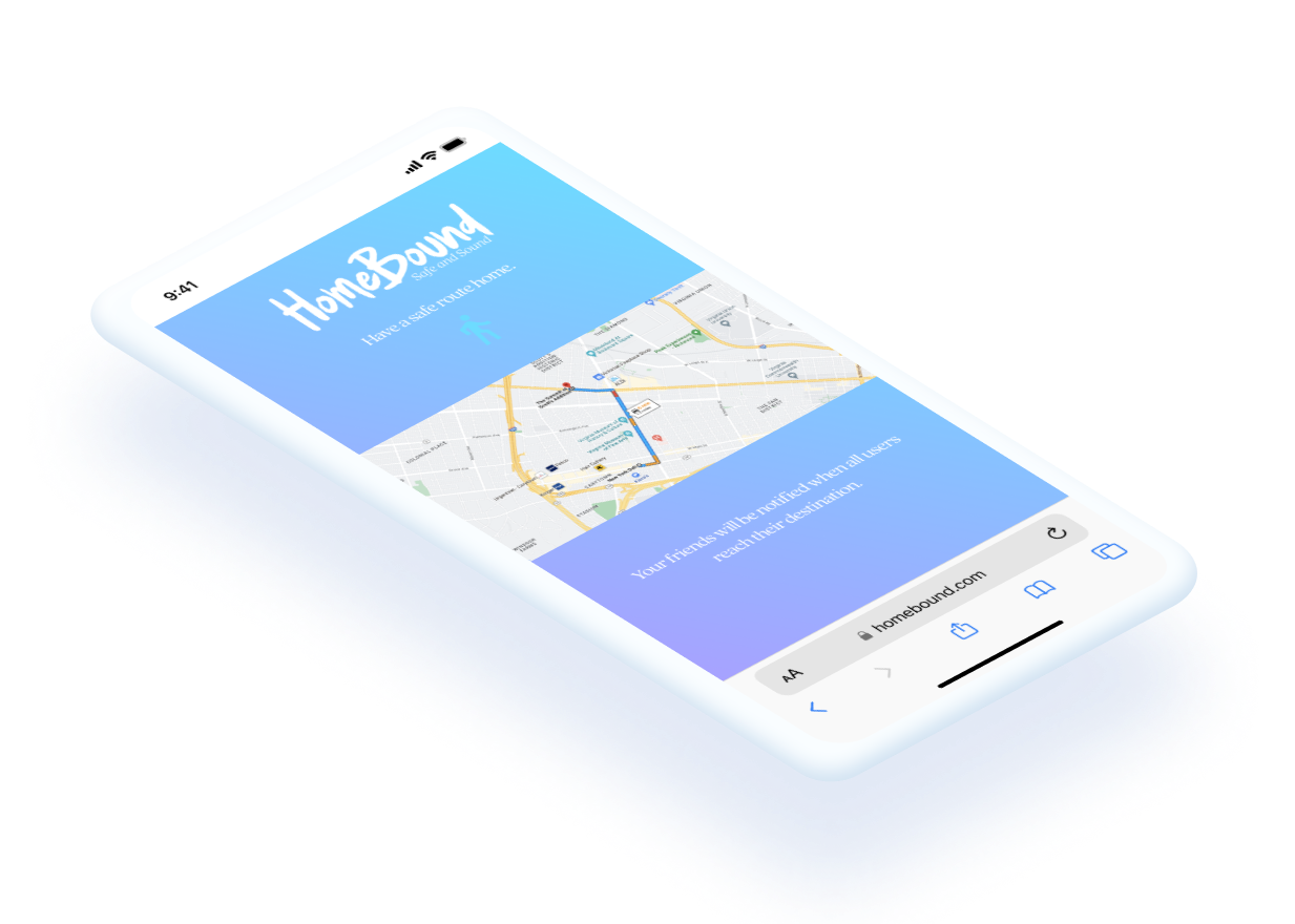
An intuitive digital product that effortlessly notifies friends of a safe arrival home, fostering peace of mind and connection among users.

Academic Project at VCU Brandenter
Collaborators:
Luke Strother (Copywriter)
Taylor Martin (Art Director)
4 weeks
August 2023 – October 2023
Figma
WordPress
OneSignal – Push Notifications
ChatGPT – JavaScript and HTML Script Generation
Product Design
Product Development
Front-End Web Development
How might we give users peace of mind when their friends have to make the journey home?

B2B Product Demo
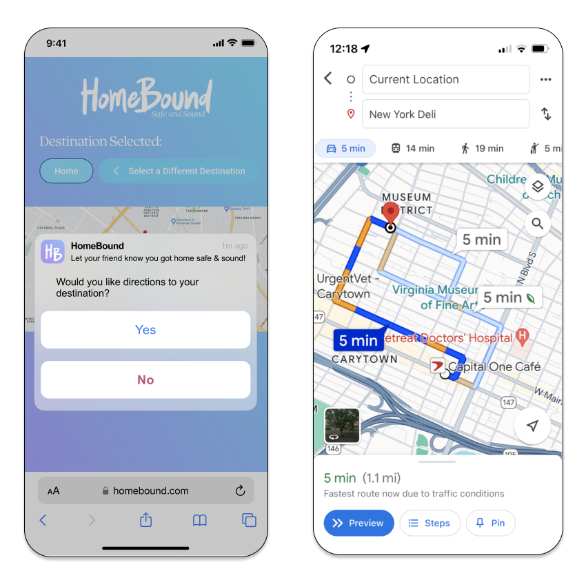
GPS Integration
Google Maps JavaScript API is integrated into the web app to provide users with a live navigation option through a seamless transition from the Home Bound mobile web page to the Google Maps app interface.


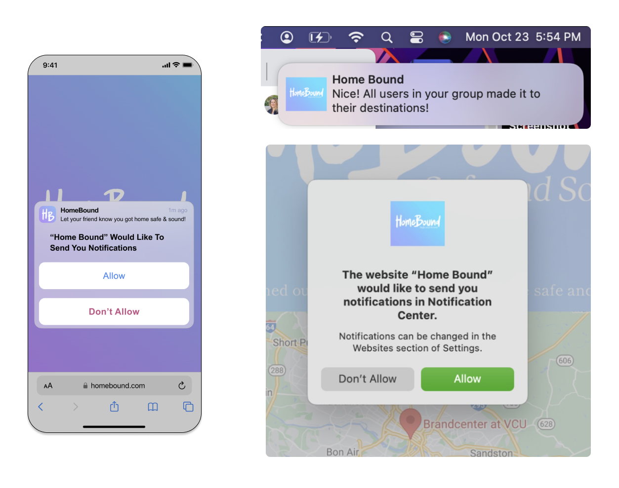
Push Notifications
Utilizing the WordPress plugin OneSignal, I was successfully able to trigger push notifications that appeared on desktop and Android mobile devices.

1. Concept Development
The concept development phase of this project was done alongside an art director and copywriting collaborator, in which we delved into establishing branding elements and product ideation.
We developed a unique and engaging visual identity for Home Bound that adopts a humorous yet comforting tone to appeal to users while simultaneously conveying its functions.
Through brainstorming sessions and iterative design processes, we honed in on a product concept that not only conveyed the purpose Home Bound but also captured the essence of the user experience to inform user engagement strategies.


2. Prototyping
Moving into the prototyping phase, I leveraged tools like Figma to craft a detailed and interactive representation of the mobile web platform. This included integrating visual design elements that aligned with the established branding, creating a seamless and intuitive user journey.
Prototypes underwent testing, with a focus on usability and user experience. Feedback from these tests informed further refinements, ensuring the final prototype was not only aesthetically pleasing but also user-friendly.
3. Product Development
Transitioning into the product development phase, I applied my budding front-end web development skills to create functional aspects of the product.
While not all components were fully developed, I successfully implemented key features such as GPS integration and successfully delivered push notifications to users’ devices. By strategically focusing on specific functionalities, I laid the groundwork for future iterations, ensuring the project’s integrity and setting the stage for further enhancements.
This phase challenged me to balance development efforts with the overarching goal of creating a reliable and user-friendly system.