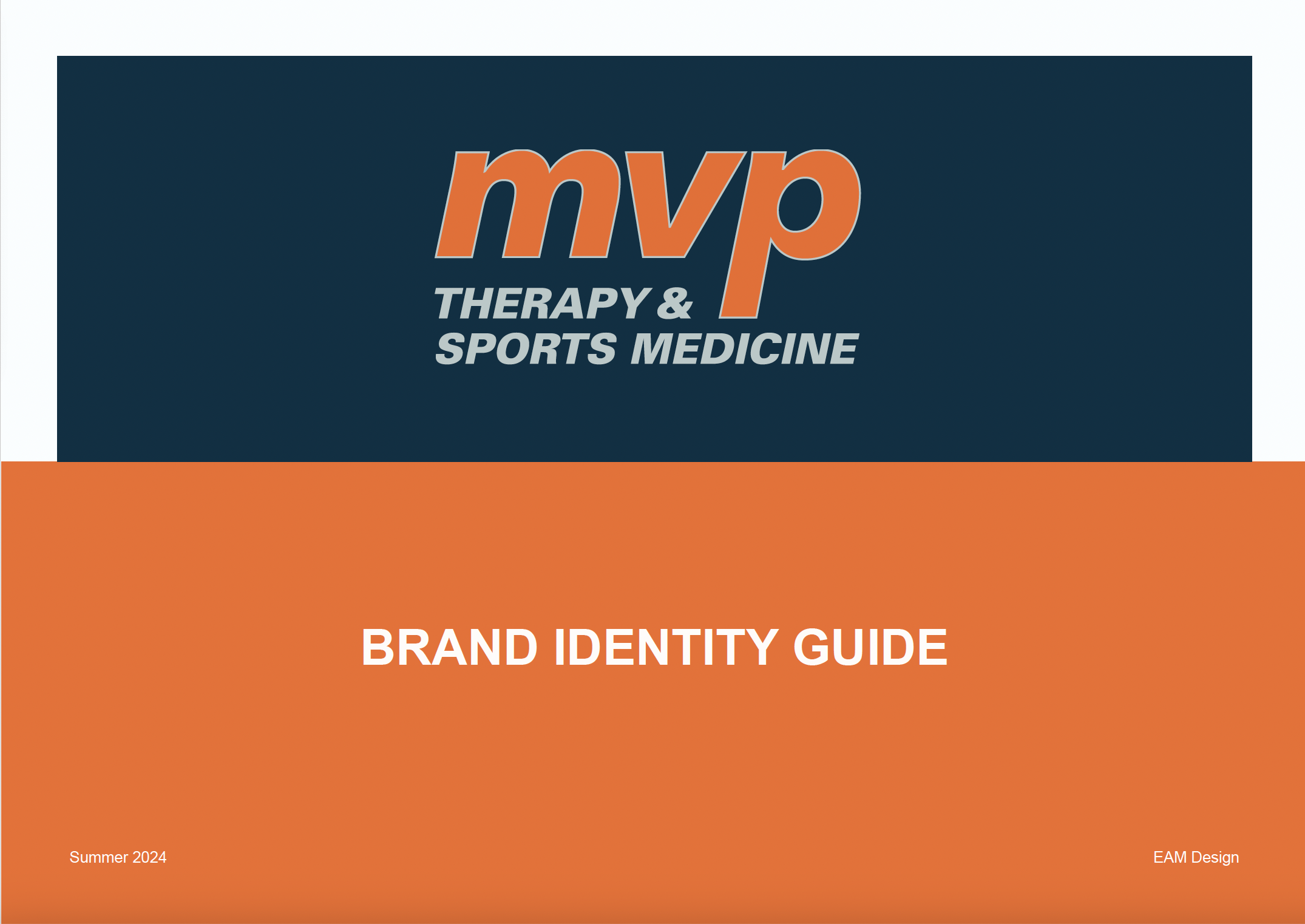
Strategy-informed brand identity update for a well-established physical therapy clinic.
Context
Freelance Design Project
Timeline
4 weeks
July 2024
Tools
Adobe Illustrator
Disciplines
Branding
Project Overview
MVP Therapy & Sports Medicine is a well-established clinic specializing in patient-centered physical therapy services. Over time, the clinic’s branding had become outdated and inconsistent, not reflecting its modern approach and growth. The clinic wanted a fresh, professional look that conveyed trust, care, and innovation to better engage their target audience—patients of all ages seeking personalized recovery.
As the clinic grows, MVP Therapy & Sports medicine is in need of cohesive branding that aligns with their reputation for excellent patient care while differentiating them from competitors in the region.
Brand Strategy
Target Audience
Primary: Patients seeking recovery from injury or surgery, ranging from athletes to elderly individuals.
Secondary: Referring doctors, wellness professionals, and caregivers looking for reliable treatment options.
Research & Discovery
Before diving into design, I conducted research to understand both the physical therapy market and the clinic’s position within it. This included:
Competitor Analysis: Identified key visual trends within the healthcare and physical therapy sectors, which were heavily influenced by sterile or overly clinical design elements. I found an opportunity to set MVP Therapy apart by incorporating a more approachable, vibrant aesthetic while maintaining professionalism.
Audience Insights: The clinic’s patient base appreciated their friendly, supportive approach to care. It was crucial for the branding to reflect these qualities while also portraying a sense of expertise.
Positioning
The brand refresh was centered around positioning MVP Therapy as a caring, forward-thinking, and professional healthcare provider. The refreshed visual identity needed to be:
Approachable to foster patient trust and comfort.
Modern and clean to reflect the clinic’s cutting-edge techniques.
Consistent to ensure cohesive messaging across all touchpoints.
Brand Values:
Compassionate care
Personalized recovery
Health and wellness
Expertise in physical therapy
Design Process
Logo Update & Variations
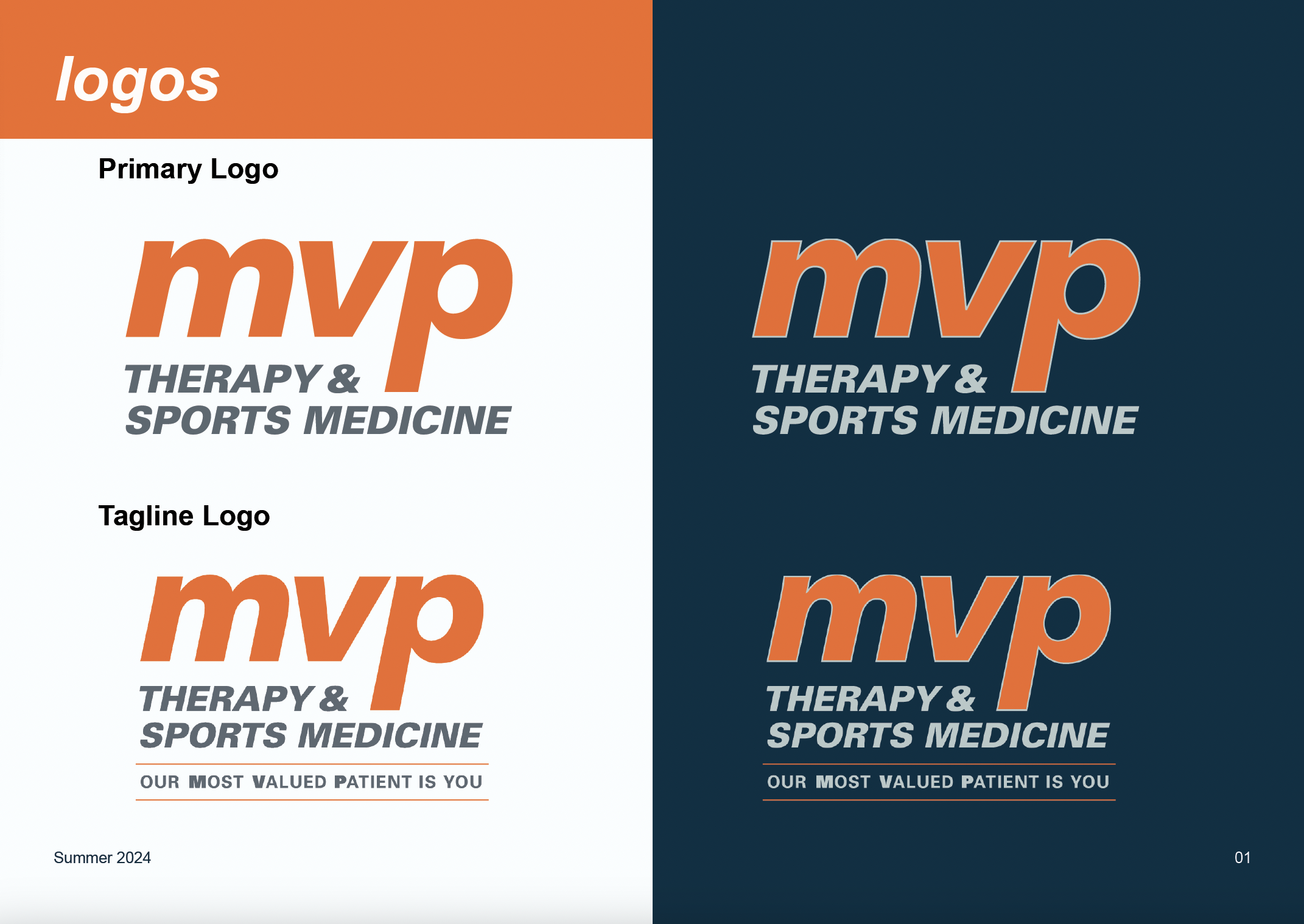
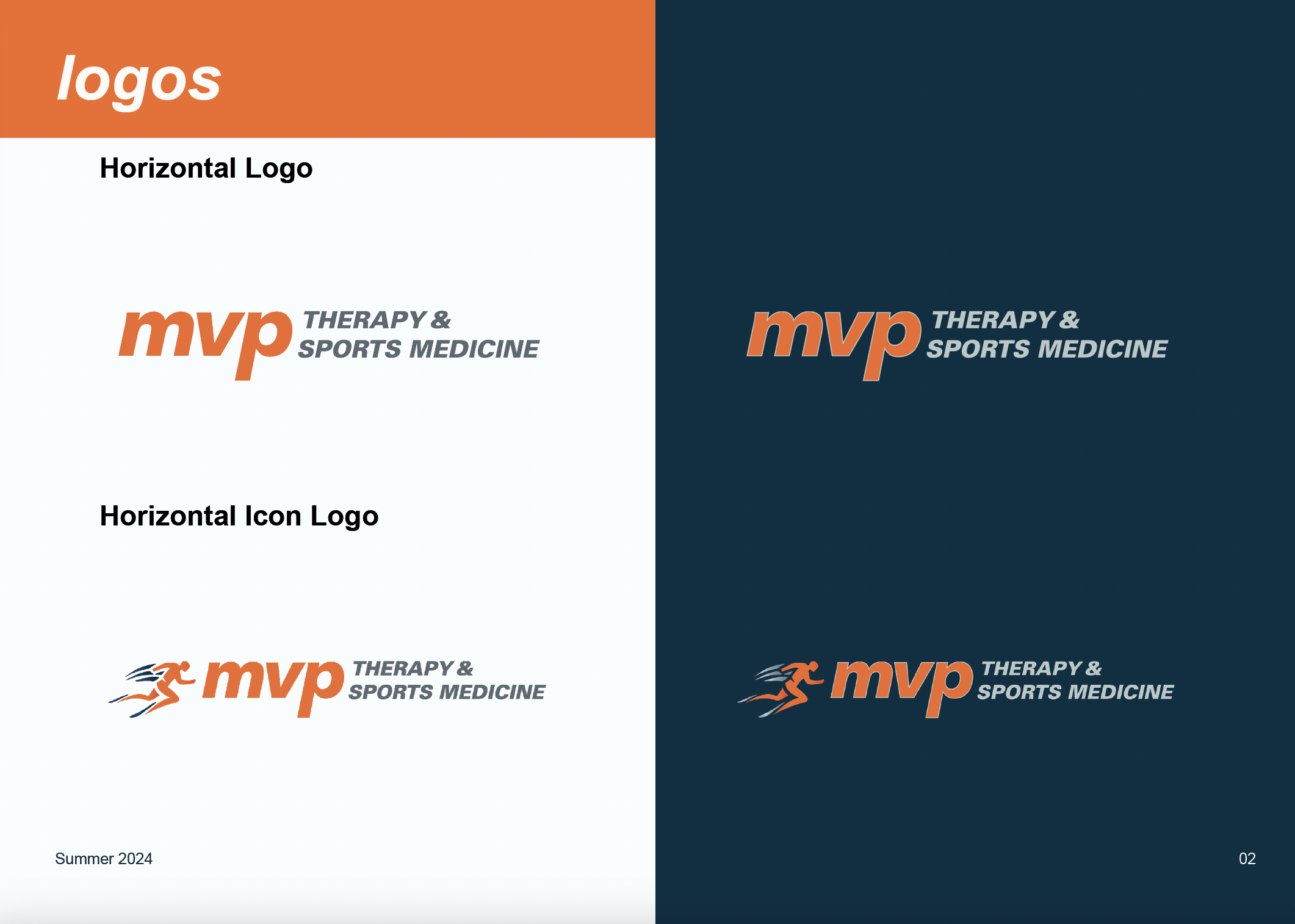
I updated the clinic’s existing logo with a consistent color palette reflective of the brand identity. Multiple logo variations were created for different use cases—primary, secondary, and icon versions—allowing for flexible application across print, digital, and physical spaces.
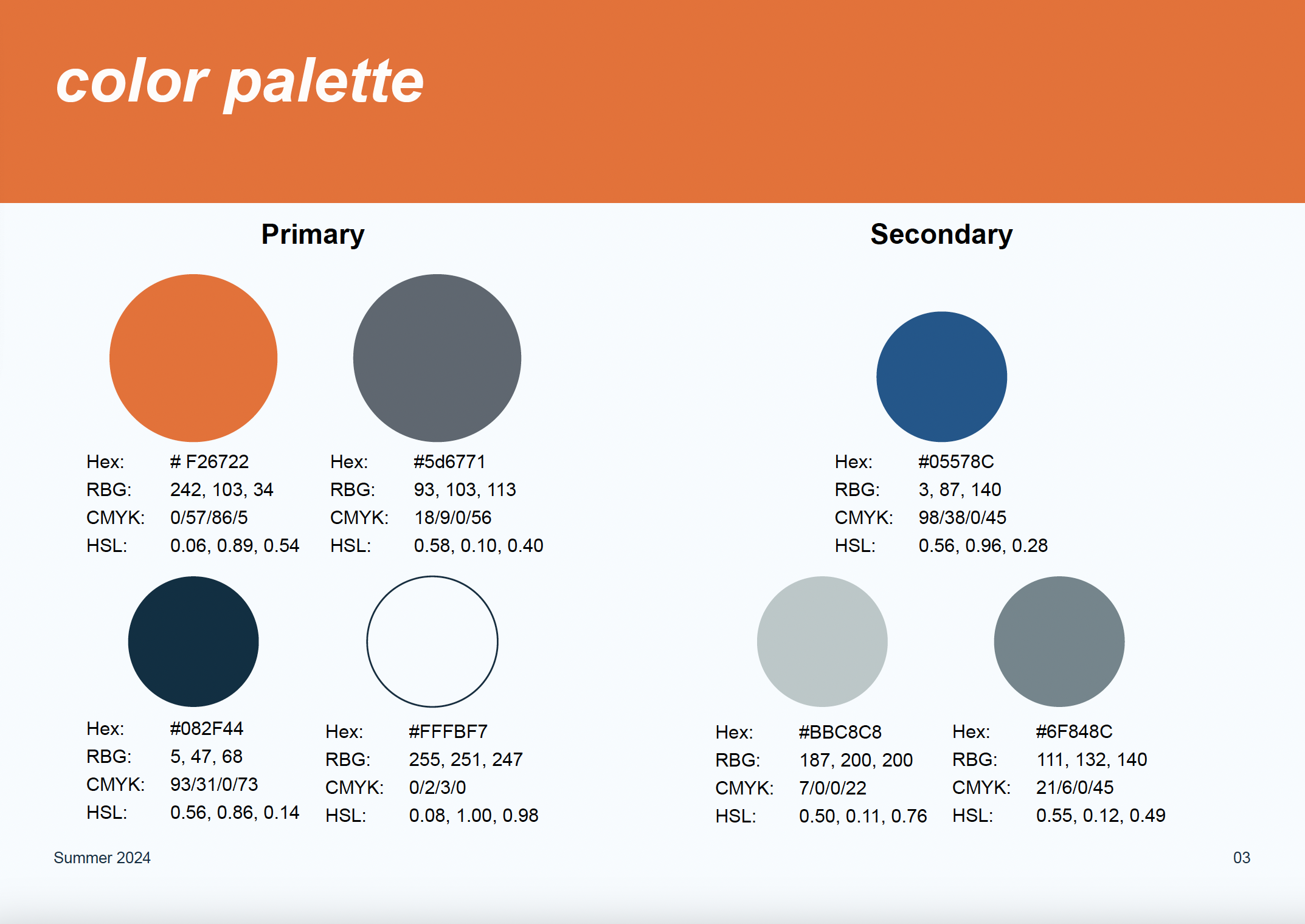
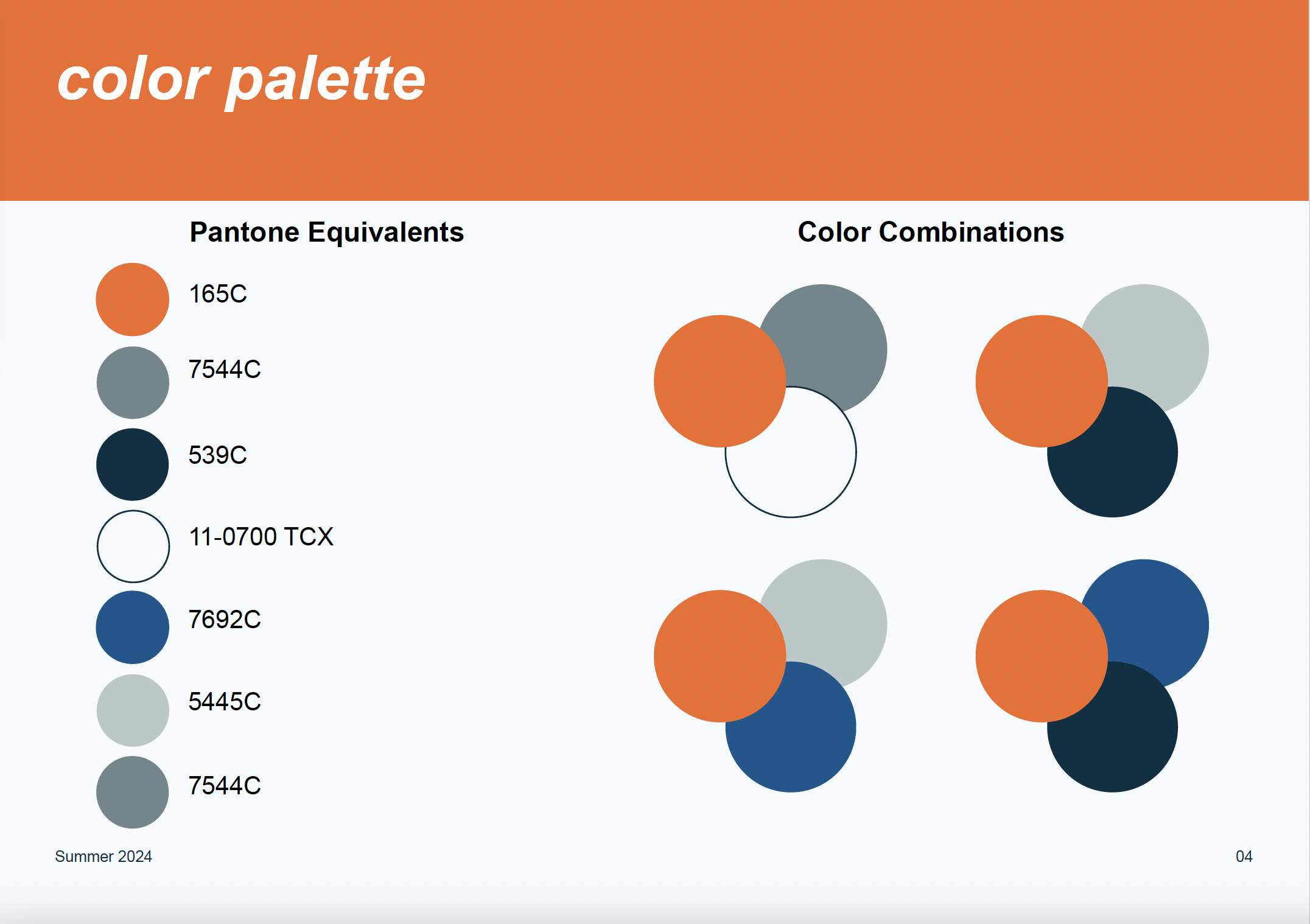
Color Palette
I developed a fresh, vibrant color palette to balance clinical professionalism with warmth. The primary color was a bright orange, complemented by deep blues and shades of gray to reflect health and vitality. Accent colors were incorporated for depth and flexibility in marketing materials.
Typography
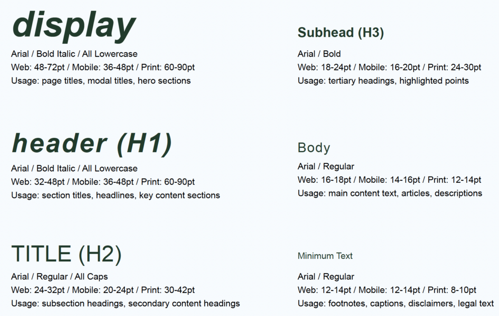
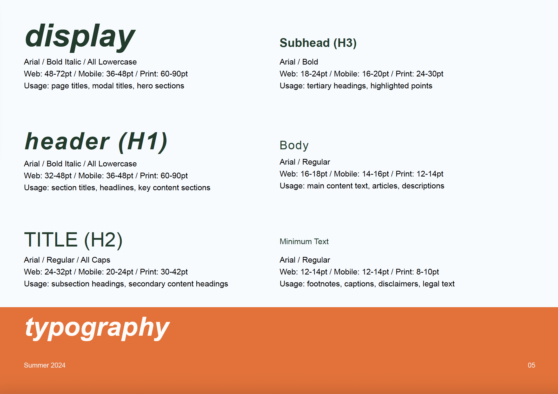
The new typography featured a modern sans-serif font that conveyed clarity and simplicity, complementing the vibrant brand colors and patterns.
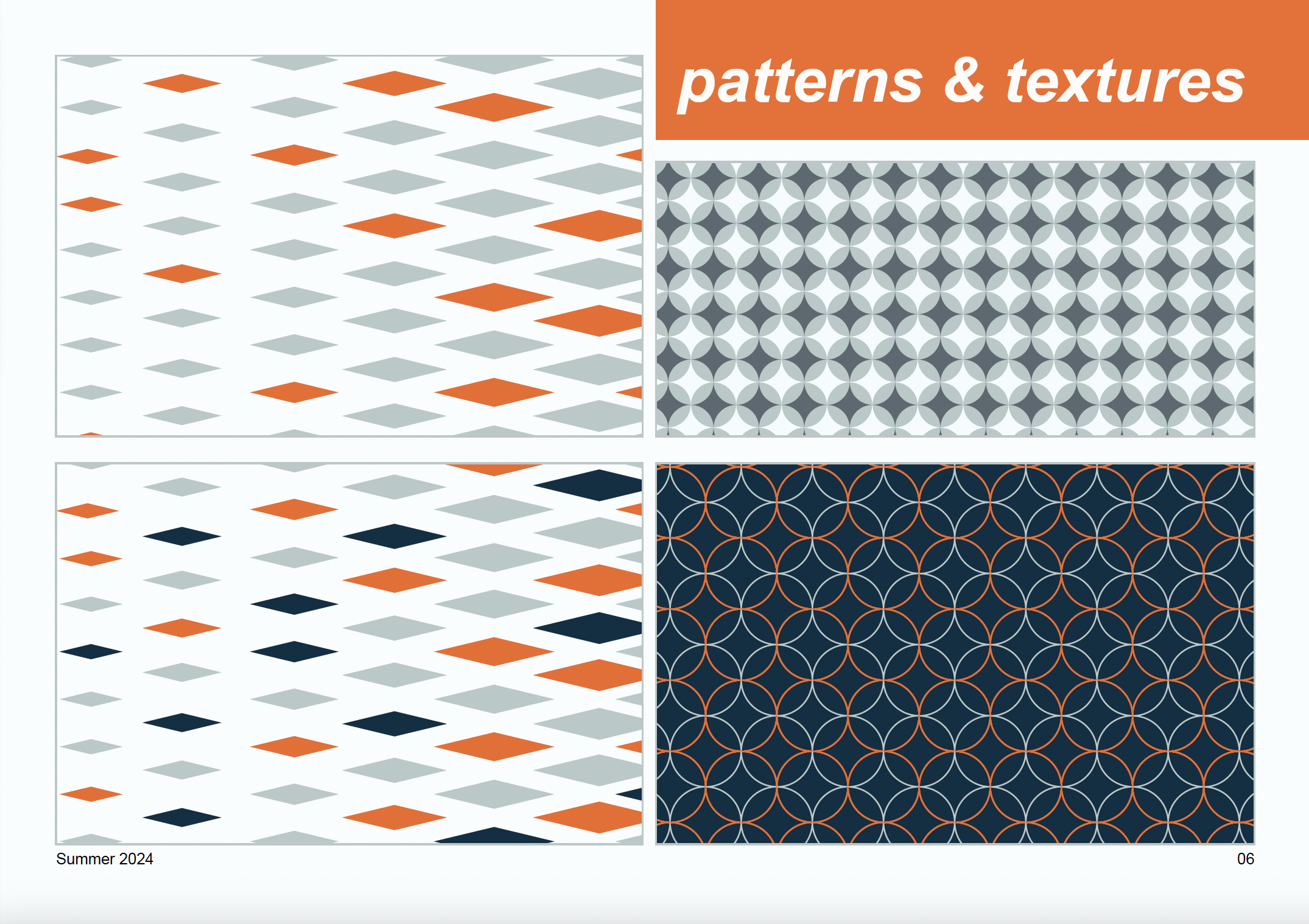
Patterns & Textures
To further enhance the brand’s visual identity, I created graphic patterns inspired by geometric shapes and movement, symbolizing the journey of recovery. These patterns were designed to be used in marketing collateral, clinic signage, and digital platforms to create a consistent and engaging brand experience.
Brand Kit
Reflection
Challenges: One challenge was striking the right balance between a professional and approachable aesthetic without making the design feel too corporate or overly playful. Through iterative feedback and testing, I refined the design to meet both the clinic’s and their patients’ needs.
Key Takeaways: This project reinforced the importance of research-driven design, especially in the healthcare sector, where trust and clarity are critical. I also gained further insight into creating scalable brand systems that are easy for clients to implement.
What Would I Do Differently: If I were to revisit the project, I would explore more interactive elements for the brand’s digital presence, such as motion graphics to enhance the sense of movement and recovery.